
Copilot Money’s design system, reviewed by designers
Copilot Money gets the invisible parts of interface design right: stable hierarchy, purposeful color, predictable action placement, and immediate state feedback. Across 74 documented states, its system reduced daily interpretation better than any budgeting app we tested. Its weaker points are chart accessibility, cramped large-text layouts, and polish that can make estimates feel more certain than they are.
This case study grew out of our six-week review, not a tour of attractive screenshots. From June 18 through July 29, 2026, Maya Chen and Theo Brooks captured the same transaction in imported, pending, reviewed, recategorized, split, refunded, and rule-applied states. We also compared 12 recurring-payment states, five account errors, four empty states, and six large-text layouts across iPhone, iPad, and Mac.
We use “design system” to mean the repeated rules that connect typography, spacing, color, components, language, and behavior. Copilot’s public visual identity matters less here than whether a user can predict what the next tap will change. That predictability is a central reason the product earned 4.8/5 in our complete Copilot Money review.
| System layer | What works | Observed limit | Score |
|---|---|---|---|
| Hierarchy | One obvious primary task | Dense investment views | 4.9/5 |
| State feedback | Changes confirm in place | Some sync timing ambiguity | 4.8/5 |
| Color | Consistent semantic roles | Charts lean on hue | 4.5/5 |
| Motion | Explains continuity | Occasional decorative delay | 4.6/5 |
| Language | Short, operational labels | Forecast confidence unclear | 4.7/5 |
| Accessibility | Strong core controls | Secondary contrast, text scaling | 4.2/5 |
1. The hierarchy names today’s job
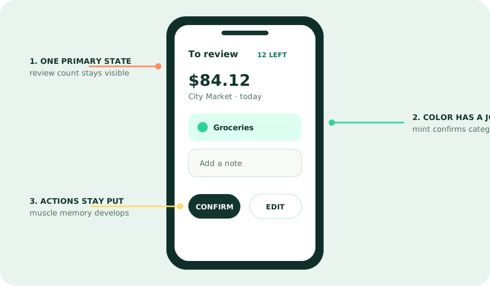
Most finance dashboards compete to show completeness. Copilot instead gives the transaction queue a beginning and an end. The count of items to review remains visible, the current amount dominates, and confirm or edit actions stay near the same thumb position. After four sessions, both editors moved through ordinary items without rereading labels. That is learned rhythm, not visual minimalism for its own sake.
Secondary information remains available without pretending to be equally urgent. Account totals, recurring payments, and category trends occupy their own views. The system occasionally breaks this discipline on investment and net-worth screens, where multiple chart controls and time ranges acquire similar weight. Those screens are visited less often, but the contrast proves how much the simpler review hierarchy is doing.
2. Color behaves like language
Mint confirms selected or healthy states; warm hues mark categories and exceptions; dark surfaces establish high-level containers. The exact palette may evolve, but the relationship stays recognizable. During our state comparison, no ordinary transaction used warning color merely to attract attention. This restraint is rare in an industry that often paints overspending red before explaining whether a rollover or reimbursement changes the story.
The limitation appears in analytics. Several multi-series charts are faster to distinguish with color vision than without it. Labels and values remain inspectable, but pattern, shape, or stronger direct labeling would make comparison less dependent on hue. Good semantic color should accelerate meaning, never carry meaning alone.
3. Components preserve context
Changing a category does not throw the user into a detached settings maze. A sheet opens over the transaction, the edit confirms in place, and the queue continues. Rules follow a similar model: the app explains whether a change applies only here or to matching history. We documented 18 component transitions and found the originating amount and merchant remained visible in 16.
That continuity explains why Copilot beat Monarch by 53 seconds in a matched 20-transaction review. Monarch supports more operations around each item; Copilot makes the common operation spatially stable. Our Copilot versus Monarch comparison treats that as a workflow tradeoff, not a universal victory.
4. Motion explains where the object went
Useful animation answers a structural question. When an item is confirmed, it leaves the review stack and reveals the next transaction. When a category changes, the label updates where the decision occurred. We recorded only two moments where motion delayed the next useful action by more than half a second, both around celebratory completion states.
The completion flourish is pleasant the first week and less important in week six. A reduced-motion setting respected the operating-system preference in the core flows we tested. That matters because financial software is repeated software; animation must remain tolerable after novelty expires.
5. The copy is compact but not infallible
Labels usually describe actions—review, recategorize, mark recurring—rather than abstract destinations. Empty states explain what data is missing and frequently offer one next step. Error language is calm. In two connection failures, however, the interface could not say whether data was delayed at the institution or aggregation layer. The recovery control was visible, but the system state remained only partly known.
Forecasts create a subtler problem. A polished projected balance can look exact even when recurring dates or variable income are assumptions. Copilot should expose confidence and input freshness as visibly as it exposes a transaction category. Interface quality increases the obligation to mark uncertainty, because people naturally trust coherent surfaces.
What rivals should copy—and what they should not
Rivals should copy the discipline: one primary job per state, consistent actions, in-context editing, and feedback that says what changed. They should not copy rounded cards, dark mode, or mint accents without the behavioral rules underneath. A design system is not a parts catalog. It is an agreement about how the product responds.
For buyers, this distinction turns into a practical question: does visual polish save recurring time? In our test, it did. But Copilot’s system cannot create Android support or full household planning. Read the seven-app ranking if those requirements matter more than the elegance of one person’s daily loop.
Copilot design FAQ
Why does Copilot Money feel easier to use?
Copilot keeps one primary state visible, gives color specific semantic jobs, places repeated actions consistently, and provides immediate feedback after rules or category changes. Those decisions reduce interpretation during daily review.
Is Copilot Money accessible?
Its hierarchy and large primary controls are strong, but some secondary text and chart distinctions deserve more contrast and non-color reinforcement. We found the core review flow usable with larger text, though a few dense views became cramped.
Does good design make Copilot worth $95 per year?
Only if the faster review loop replaces recurring effort. The design supports Copilot’s 4.8 score, but people who review finances rarely or need Android and household planning should choose on workflow rather than polish.